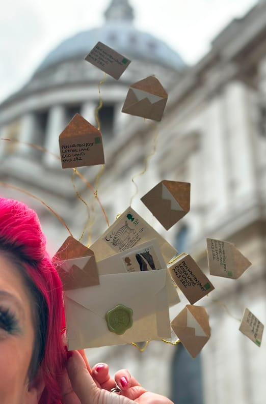


No. Not really. Not in the way the question assumes.
If you send handwritten direct mail, or you’re thinking about it, colour is probably one of the first things you’ll wonder about.
- Duck Egg Blue, Fussy Beige, Cosmic Latte or Kitten Whisker Grey? (Yes, these are actual colours!)
- Warm, Earthy Kraft or Swan white perhaps?
- Does lilac actually bridge the gap between a soft pastel and a high impact shade?
And every time I’m asked any of these questions, or the millions of others related to the topic, I have to gently move the conversation somewhere more useful, because colour is the wrong question wearing the right question’s clothes.
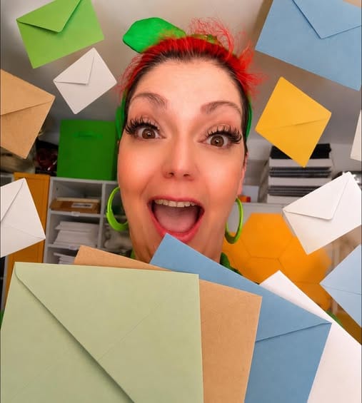
What Really Determines Whether an Envelope Gets Opened
There is no magic colour. Very little credible research shows one envelope colour reliably beating another. What there is plenty of research on is something simpler and far more important: whether your envelope looks like a person sent it, or whether it looks like marketing.
That decision gets made in about a second.
- The Letter gets picked up.
- Given a quick once over.
- Sorted into “open this” or “bin it.”
Your envelope does most of its work before anyone reads a single word inside it, and looking like marketing is an expensive mistake to make.
After sending thousands of handwritten letters, here’s the thing that still surprises clients: bright colours, heavy branding, and a shiny finish rarely performs well when it comes to envelopes and letters alike.
Years ago that look helped you stand out. A bit like having a pager or sending a fax. Now it does the opposite. We are all walking lie detectors for advertising. We clock it instantly and filter it out without a flicker of guilt.
So the envelope that gets opened is often the one that looks like it came from a person. Someone who knows your name and thought you were worth the effort.

What the Research Reveals About Human-Looking Mail
In a 1997 medical research mailing, hand written envelopes pulled a 41.6% response rate against 35.9% for computer-printed ones. Same letter inside. The only difference was whether the outside looked human. More dramatically, a controlled fundraising test for the American Heart Association found that hand addressed direct mail beat a standard double-window envelope by a whopping 346%.
But here’s the part I really find interesting. In that same test, computer-simulated handwriting performed slightly better than real handwriting. The recipient couldn’t tell the difference, and it didn’t matter. What mattered was that it didn’t look like a window envelope full of bad news.
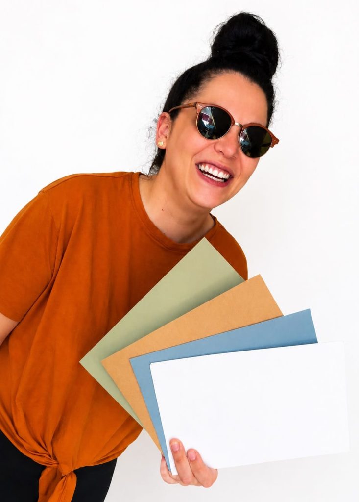
Why Colour Gets More Attention Than It Deserves
So why does everyone ask about colour? Because colour is the easy lever. It feels controllable. And it does do something, just far less than people hope.
The right colour reflects your audience and your brand rather than chasing a “best” shade that doesn’t exist. For direct mail for estate agents selling premium homes, a heavier white envelope with a matte finish suits the experience they’re selling. Soft lilac works beautifully for pet brands, because it’s warm and approachable and doesn’t read as a flyer. Soft blue tends to do well for brokers and professional services, because blue quietly says trust without trying. And plenty of clients won’t touch anything but plain white, because plain white is exactly what real letters arrive in.
Kraft is a perennial favourite too, particularly for local businesses, premium brands and charity direct mail, where it feels considered rather than corporate.
None of these is a magic colour. Each one is a signal, matched to the right audience. The colour isn’t the point. What the colour says is.

The Envelope Details That Influence Open Rates Most
The signals that do the heavy lifting.
If colour is a minor lever, these are the major ones. In our experience, these are the details on handwritten envelopes for business that move open rates far more:
- A real stamp instead of printed postage.
- A hand-addressed envelope instead of a printed label.
- Quality matte paper instead of a glossy finish.
- Minimal branding on the outside.
- The right size for the contents.
Each one whispers the same thing: a person sent this, on purpose, to you. Hand addressing alone gets envelopes opened far more often than a machine-printed address, and a real stamp does similar work, because metered or printed postage is the universal tell of bulk mail.
You’ll also see eye-watering numbers thrown around in this industry. “300% uplift.” “99% open rates.” Treat those the way you’d treat any figure that sounds too good to arrive with a source attached. The real, measured gains from handwritten marketing letters are impressive enough without the inflation.
Does Size Really Matter?
Here is an age old question for you – Does Size really matter? When it comes to a divine slice of Chocolate Mousse Cake; absolutely! When it come to Envelopes; a little.
One pattern we see consistently: DL envelopes (the long thin ones) tend to get the lowest open rates. Think about what arrives in a DL envelope. Utility bills. Takeaway menus. Leaflets. People file that shape under “admin or marketing” before they’ve even turned it over.
C5 envelopes tend to do better. They feel more substantial, the letter sits flat instead of folded into thirds, and the whole thing reads as correspondence rather than circular.
It won’t make or break a campaign on its own. Almost nothing does on its own. But every small signal adds to the half-second verdict on your letter.
The Promise Your Envelope Makes
This is the part that most people skip and a real point of annoyance for me.
You can get every bit of this right. Perfect stamp, perfect handwriting, perfect weight of paper in exactly the right shade. And then they open it to find a generic sales pitch that could have gone to ten thousand people. Or worse, copy that’s obviously machine-generated.
That’s a broken promise. The envelope said “a person wrote to you.” The letter said “no they didn’t.”
Handwritten direct mail works because it feels personal, considered and rare. The whole reason it gets opened is the expectation of something human inside. If the inside doesn’t live up to that, your whole campaign will have gone to the dogs, as they say.

Human Signal Theory in Practice
This is what we mean at Pen Written Post by Human Signal Theory. Every detail, from the stamp to the sentence, either tells the reader there’s a real person behind the message, or quietly admits there isn’t. The envelope starts the sentence. The letter has to finish it.
So by all means test colours. Test sizes, finishes, stocks. It’s some of the most useful direct mail marketing you can do, because your audience will tell you more than any blog post can, including this one. But don’t mistake the colour question for the real one.
The real question was never what colour to use. It was whether the whole thing, inside and out, looks like it came from a human who meant it.
Final Thought
Getting the envelope right is the easy half. The hard half is making sure what’s inside is worth the moment it took someone to open it.
That’s what we do. Pen Written Post writes and sends handwritten letters for businesses that want to be remembered for the right reasons, without anyone handwriting three thousand envelopes at the kitchen table. If you’re planning a campaign and you’d like it to land as real correspondence rather than recycling, come and have a conversation with us at penwrittenpost.co.uk.